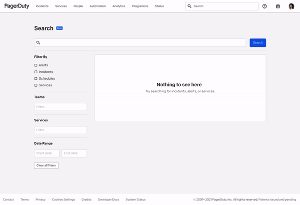
PagerDuty: Reimagining Analytics and Search
Since May 2021 I have been a product design intern for the Search and Analytics Team at PD. As part of my role, I worked with my PM, design manager, and fellow engineers to drive higher engagement towards Analytics by both improving the current UX of the feature as well as by designing forward-facing experiences for Search. In PD’s product currently, Search has been in beta for the past year, and I helped drive it to GA (October 2021) as well as providing designs for future Search milestones to improve capability.
ROLE
Product Design Intern
TOOLS
Figma, Pendo
TIMELINE
May 2021 - Present
FINAL PROTOTYPE
FROM THE TOP
CONTEXT
PagerDuty’s current search functionality encapsulates rudimentary search techniques to deliver desired results. For larger Enterprise and Mid Market companies that have a ton of data on PagerDuty’s platform, finding any object with the current search features can be cumbersome and leave end-users frustrated at the amount of time spent trying to get to what they need. Because PD houses a variety of objects (incidents, alerts, schedules, services; to name a few), search has an increased value in the product and desire of use. While ‘Uptime is Money’, having a search experience that allows users to get access to their data rapidly is of utmost importance.
PROBLEM
While the majority of PagerDuty’s platform focus is on alerting customers about real-time problems, finding historical incidents is also of increased value and can help users learn more about their impacted services. However, due to the current nature of search, users spend too much time trying to find their incidents, navigating through multiple pages. There are a multitude of reasons why viewing historical incidents could be beneficial to customers:
metrics for how long it took to resolve an incident (MTTA, MTTR)
Analyzing the frequency of a type of incident
Auditing of incident creations through PD’s platform
Previously, searching for incidents by title was brutal. We had to go through like 400 pages and say ‘is it on this page, nope, not there. Next page, nope.' — PD customer
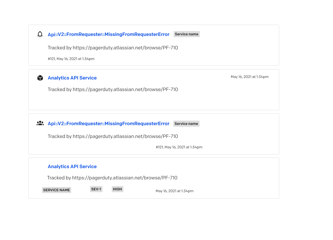
Current Search UX:


1st image: Search results from EA in 2020. 2nd image: current Search results designs.
Because PD collects a variety of data objects, being able to search for other objects like services, alerts, schedules, etc. also are desirable search requests and can help customers:
look up on-call team members
update schedules and escalation policies
look for incidents specific to a service
However, it’s also hard to find these objects. My task was then to research more on the current search feedback, and how to best proceed for the GA launch of search in early Q4.
RESEARCH
I gathered information from customer calls and NPS response feedback to figure out where the biggest problems in Search lie. Some of the important feedback received were that:
Scrolling through arrays of incidents can take a while
There is no way to search for incidents by keyword, only ID
PD is a rather complicated platform at first— and not having a thorough search functionality causes confusion when onboarding
We have so many incidents per day coming into our PagerDuty instance that if you just use the incidents list there’s going to be multiple pages you need to scroll through...Search is an easy way to pull up incidents just by knowing what the title was, even if you don't remember what service it was on — PD customer
How can we increase Search engagement while enabling rapid access to data when every second matters?
This was the main question I had. While the long-term business goal is to also increase engagement towards Search and Analytics, I also wanted to ensure that search was easily discoverable. I set three main outcomes for this project:

EXPLORATION
My designs centered around the idea of keeping Search personalized. What have you viewed previously? Is there anything you have repeatedly seen? How can we best tailor the experience to get you your results faster?


In this exploratory phase, I tried to take elements from Search in other software to add aspects like:
recently viewed/searched
filtering: by tags? dropdown menu? Clickable objects?
IDEATION
With these notions in mind, I kept iterating. Here is what I changed in this next iteration:
designed the navbar to include a static search bar, as Search had an expandable bar only when hovered over previously. Through this idea, I thought that more customers would easily see the search feature in the navigation, thus increasing discoverability.
being able to filter before typing a term, something not currently offered in Search.
empty states
dual search history/searched terms view


CURRENT DESIGNS AND WHY
I presented these designs to the greater UX team, and I received this feedback:
how do we scale for the large variety of objects in our designs?
dropdown view with both recently searched + search history is too crowded
how will these designs be incorporated into mobile?
autocomplete?
I also had the chance to present these ideas to the Analytics team and received this feedback:
lag for incidents uploaded into PD and Search— hard to incorporate status into search results cards for incident
autocomplete is difficult for engineering to implement
With this feedback in mind, I had to prioritize how we want to use and interact with Search.
Search Results Cards:
I followed a modular approach while designing these. The layout of the cards and tags allows for quick scanning of relevant information while in list view. It also includes incident # and priority. Later on, we plan to:
use iconography to differentiate amongst the different objects returned in the query
pagination instead of ‘load more’ button to disassociate from infinite scroll


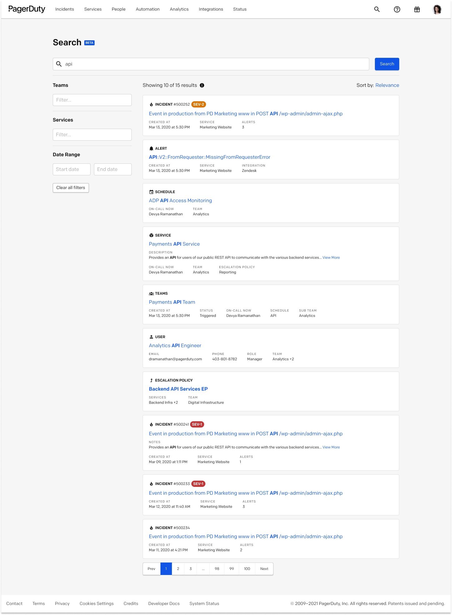
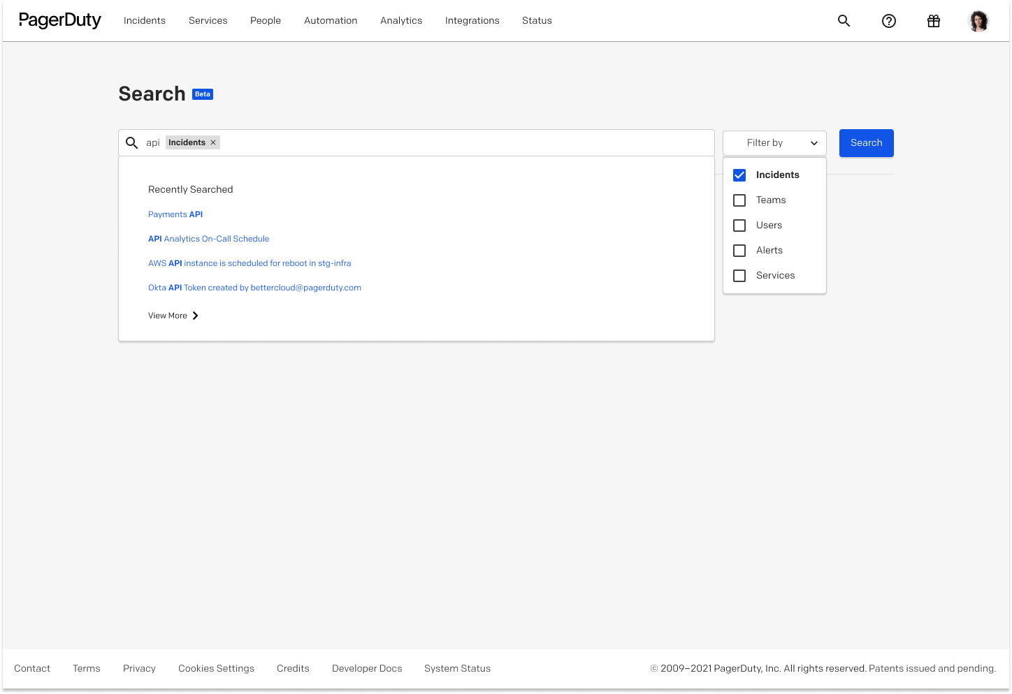
Search dropdown:
Following the idea that search can start from the exposed search bar in the global nav, I followed a pill format to display the different objects that can be searched in PD. This allows for filtering into an object before typing a term. I also decided to keep recently searched terms, as it is the more common use case historically— customers often had the search pattern of repeatedly looking up the same term (possibly to find the same/similar incidents).
From the navbar dropdown, you can also navigate to advanced search, which in the future will evolve to include much more advanced functionality, where other objects like postmortems, EPs, business services and users will be added in. Advanced search would essentially have the same flow as the navbar dropdown but with more objects and possiblly house more features.

In both the dropdowns, search history is now easily accessible for a more comprehensive look at recently searched.

Multi-select allows for customers to filter into different objects. Though this would require incorporating wildcards into the logic for search, I think it would help narrow down desired fields and get to the result faster. Also, when clicking into a certain object, Search will show you what you recently saw.
Because PagerDuty is used mainly by engineers, I wanted to accommodate for keyboard-heavy customers as well as customers that click into elements. Here, customers can simply tab through Search to get into desired filters and to get results. For the use case that customers do not necessarily know what object they are searching for as well, this can be helpful. Customers can either click directly into objects to filter before typing a term, or can start typing and filter if needed.

HEURISTIC EVALUATION + FUTURE IMPROVEMENTS
The UX research team conducted a Heuristic Evaluation on my concept + prototype. Even though the designs were still fairly early in the process, knowing how to improve the dropdown experience was important to see how to move forward with it (or change the concept entirely!) I gathered a few thoughts from the HE and how to improve the dropdown before it goes into development:
#1 concept brought up: is this too complicated?
is basic search advanced search? should we make basic search actually basic (i.e. no dropdown)?
add more granularity to the advanced search filters
improve iA of search and work backwards from there
Moving forward, I want to take a step back and really think about what Search in PD has to be. Does it have to be as complicated as it is now? I am thinking about the smallest possible step for pushing the designs forward, whether that means stripping Search of some functionality or iterating on the concept of advanced vs. basic search more.
IMPACT
Search has been accessible to 100% of customer accounts since September 2021. From my designs, the search results cards and empty states have been shipped, as well as the visible search bar. The dropdown is on the roadmap for post-GA.
Some metrics about Search currently:
since the navbar has been shipped and visible to all customers, search activity has increased from 55 active accounts to nearly 1,555 active accounts, with over 40k all-time active users
search requests have gone up from 4k to almost 23k
beat our success criteria 4 months (a whole quarter!) earlier than expected for number of active users/searches

TAKEAWAYS
designers tend to over-engineer things. I learned to take a step back, to consult with designers and my PM to decide which features are most important to our use cases. Featuritis is real and as a designer, I have to be aware of this!
even the smallest changes can have massive impact. When the exposed search bar was shipped, we saw a massive increase in traffic to search. And all it took was to just expand the space! I learned that it’s not all about having major designs, but understanding how the simplest changes can directly change the way customers interact with your product.
keeping my PM/engineers in the loop. Though it’s easy to communicate to designers about what features I want to include in my designs, I was surprised when I presented the same thing to my team and the different feedback I received. I found it really helpful to constantly keep people in the loop, as most of the time, I got more information about what is feasible or not.
believing in my capabilities as a designer. As this was my first role out of college, I felt like the stakes were way higher. However, I am still learning every day I show up to work, and I know that if I keep showing up with an eager mind, I will succeed as a designer and make meaningful connections on the way. I’ve learned so much and I can’t wait to keep going!

CVS Health x USC DFA National Project
Fall 2020

The interactive Figma can be reached at https://www.figma.com/proto/Dku4wjhoH1HzuWMFEkHWhV/CVS-Prototypes?node-id=414%3A114&scaling=scale-down
Navigation
Challenge ☞ Research ☞ Ideation ☞ Our solution ☞ Final prototype ☞ Usability Testing ☞ Takeaways
Role: Designer + Researcher
Duration: September 2020 - December 2020
Over the 2020 fall semester, I teamed up with CVS Health through USC Design for America to tackle the challenge of creating sustainable products while maintaining the quality of CVS health products. While ensuring sustainability practices are transparent to consumers and employers alike, we hope to help CVS Health redefine their sustainable products and, in turn, hopefully encourage customers to make more sustainable product choices.
CHALLENGE
Let’s face it: in today’s day and age, we are constantly on the lookout for how to better ourselves and our climate-conscious choices as individuals. In a world where there is a large array of sustainable practices to take up, why is there a disconnect when it comes to shopping for products? This lead us to our initial question:
“How can we encourage CVS shoppers to choose more sustainable product choices?”
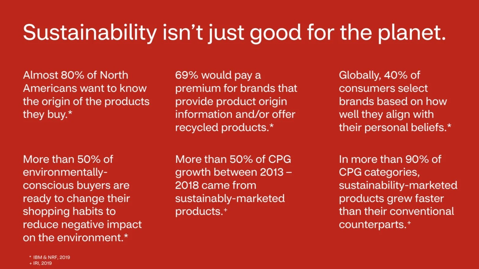
RESEARCH
My team started off with some secondary research and found these statistics on the connection between sustainability and products:
We focused on hyper-local insights, emphasizing the individuals in the South LA community, as well as the large surplus of students that shop at the CVS located closest to USC.
From our in-depth one-on-one interviews with individuals, we found:

While conducting personal interviews as well as a broader survey, we asked ourselves these leading questions:
How can we market sustainable products so that they can compete with name-brand products in terms of trust and quality?
How can we incentivize sustainable products for all demographics?
Our survey insights found:
1. Consumers go for name-brands because there is more trust that those products are of good quality. 🧴
2. Consumers are willing to pay more for sustainable products, however price and quality are prioritized. 💳
3. Trends and packaging are important when incentivizing sustainable products. 📈📉
Why do these insights matter? ☞
1. Our solution needs to be informative when the customers are shopping for products. There is a need for better labeling/marketing/advertising to educate customers on what products are sustainable, and in turn, how they are sustainable.
2. The solution needs to incentivize customers to buy sustainable, even if the product may be at a higher price point.
3. Our solution needs to show customers their personal environmental impact when buying products. Giving customers immediate feedback about their purchased products incentivizes changes to their personal buying habits.
From here, after synthesizing our insights, we identified our key stakeholder for a possible solution:
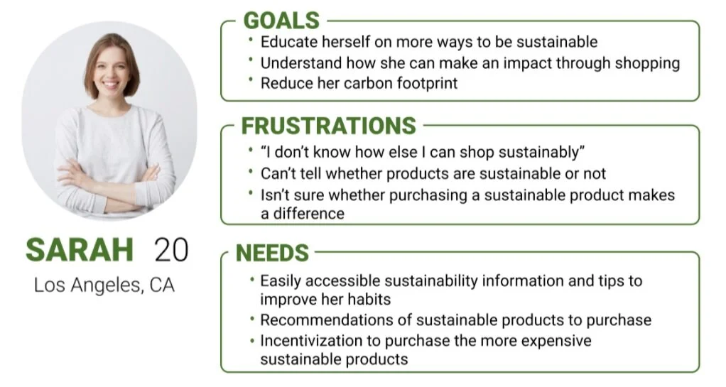
Why her? ☞
Our main goal for the project was to find a solution to ultimately change consumer buying habits and to prefer more sustainable product choices overtime.
Younger generations are more susceptible to changes in consumer behavior Thus our persona includes someone who is:
1. Aware about sustainability issues currently
2. Educated, conscious of waste management
3. Eager to educate themselves more on possible sustainability initiatives
JOURNEY MAP

Our journey map showed us key pain points of our shopper:
1. People don't spend a lot of time in stores. They can't browse a multitude of products in-store with limited time.
2. Pressure to shop sustainable. Consumers want to shop sustainable but don't know what is marketed as a sustainable product or not.
3. Lack of awareness about their own personal impact about their sustainable purchase. Consumers are willing to pay more for sustainable products, but would like to know where the extra money is going towards a greener planet.
This informed us to focus on three specific design criteria for moving forward:

Which led us to our targeted question:

With this in mind, we began to develop ideas that would fit our three design criteria: systems that would educate, incentivize, and show consumers their personal buying impact.
IDEATION
Initial directions:

INITIAL SKETCHES

CHOSEN SOLUTION
An integrated feature in the current CVS app providing sustainability metrics and special rewards for shopping sustainably. 📲🌳
Why this solution? ☞
Researched into our target audience, young college-aged individuals 👩🏾🏫
Found through our interviews and surveys that people are well-versed in using digital app formats, and a digital format is a greener alternative than a paper solution (and CVS executives said they want to promote more app usage across the board) 📱
People don’t have the time to stay in-store and weigh all their product options with new shelf-remodeling 🕴
Wanted to create an in-app solution that works in cohesion with the existing CVS app 📱
Main features of our prototype
- Gamified sustainable rewards system
- Digital receipt from in-store purchases
- Sustainability initiatives ranging through the whole product life-cycle
- Personalized information metrics about purchasing impact
- CVS Promise to ensure transparency between the user and the company on their sustainability initiatives
Having these thoughts in mind, we sought out to create some mockups that would best represent what we want!

WIREFRAMES

HI-FI WIREFRAMES

STYLE GUIDE

Our style guide consists of colors that are included in the CVS app, as we wanted to mimic their style guide, while keeping our feature intuitive and cohesive with the rest of the app.
FINAL PROTOTYPE

The interactive Figma can be reached at https://www.figma.com/proto/Dku4wjhoH1HzuWMFEkHWhV/CVS-Prototypes?node-id=414%3A114&scaling=scale-down
KEY FEATURES
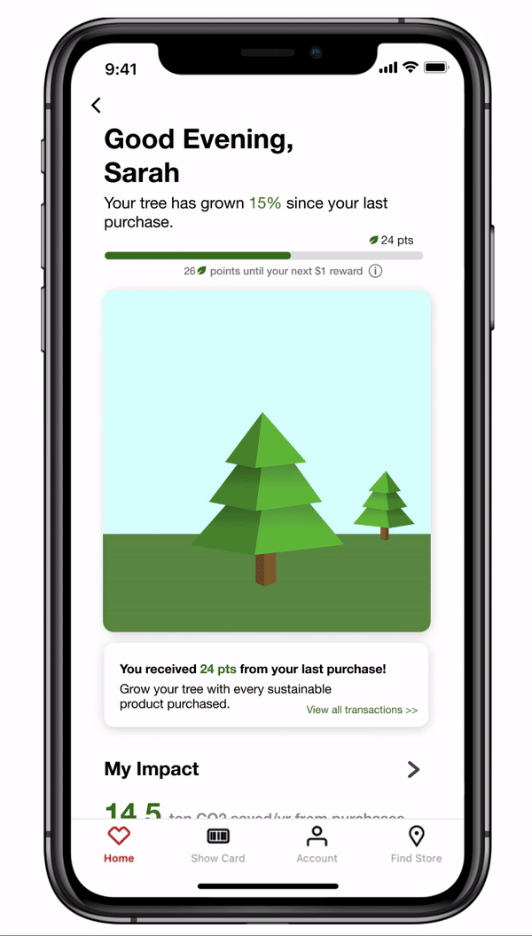
Sustainability rewards system
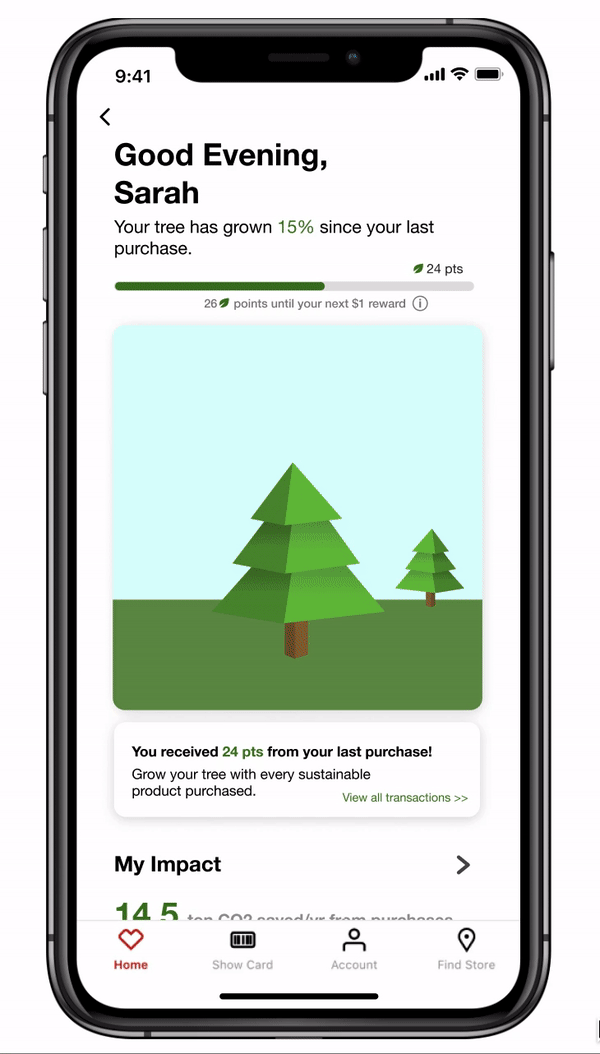
Our in-app feature includes a points system for customers, which is tied into the current CVS rewards system. Depending on the price-point of the sustainable product, customers gain points, which can then be turned into rewards for shopping sustainably.

Gamified Rewards
With every sustainable purchase made, a customer can personally see their tree grow with the amount of points earned. Through this, we thought having a more relatable visual metric would provide for better positive reinforcement of shopping habits.

Sustainability-focused Digital Receipts
- Customers can scan their ExtraCare card to receive digital receipts, with the ability to view past purchases and how many sustainable points were earned per transaction.
- Can see sustainable points for each sustainable product purchased.
- Can see the points earned per sustainable product, as well as other alternative sustainable products to purchase.
- Receipt includes ways to sustainably recycle products after usage.
Sustainability Report
- Metrics page showing customer’s overall carbon footprint and breakdown of carbon per purchase category.
- Relatable metrics to provide for a more personalized factor when looking at KPIs of sustainability.

Sustainable Initiatives
- Educates customer on how to properly recycle/dispose of products purchased; emphasizes sustainable practices through the whole product lifecycle.
- Can see what products and ingredients are considered to be green and alternative sustainable practices.

Sustainability Promise
- Provides ways in which CVS Health is taking efforts to become more sustainable.
- Encourages other sustainable practices customers can take up.
- Holds CVS Health accountable for what they promise to do.
USABILITY TESTING

We wanted to incorporate a heat map into our usability testing to see what the visual hierarchy of our feature was like to end-users. What we learned from this heat map ☞
Buttons need to be more prominent in the design as a button, not just readable text 🔘
Hierarchy of information is so critical — most key elements should be easy to find from the first screen 🥇
Too much scrolling could mean that some elements of the screen will be looked over or skipped 🥺
TAKEAWAYS
This project challenged me in a multitude of ways— but I am proud of how our solution turned out and how much I learned about sustainability as a whole. As a student designer, I am always on the hunt to see what else I can learn and to see how I have improved over my course as a designer through various projects ☞
The power of asking questions and testing different hypotheses 🙋🏾♀️
The tradeoff between ultimate ideation and prototyping with time ⏳
To always check back to make sure the solution is aligned with the business goals 📊
Redefining sustainability may seem like a daunting task but with lots of user testing, insights, and idea generation, we can start to re-design a world where changing long-term shopping habits is a possibility.
NEXT STEPS
Moving forward with our solution, we want to take the insights gained from our heat map and better organize our visual hierarchy so that there aren’t features of our prototype that are overlooked. We would also be conducting more user testing and improving our prototype.
Nokia Venture Studio Internship
Summer 2020
Over the summer, I interned for Nokia under the Nokia Software Group (NSW) through the Venture Studio. The Venture Studio is a design studio that oversees many projects for NSW, through collaborating, researching, iterating, and prototyping different tools through design processes. While working under my manager, who also happens to be the Chief Designer for NSW, Jose De Francisco, I was able to firsthand apply my classroom skills to real-world applications and experience the design process in a company.
A key pivot in this internship was the notion of being fully remote. Due to the COVID-19 pandemic, instead of being in Naperville, Illinois, where the internship was set to take place, I was working 40 hours a week from my own home. Seeming daunting at first, the virtual internship experience made me hone in on my true passion for design and user experience, and every challenge throughout the internship I took as another learning lesson to gain critical skills in the field.
Due to the NDA I signed prior to joining Nokia, I am not able to share any specific details or show in-depth prototypes about the projects I worked on, however, I can mention key features of my project and takeaways from the internship.
Nokia Collab Studio Module
Role: Researcher/Designer
Duration: 10 weeks
Tools used: Adobe XD, Mural
Creative Brief:
As part of my research for the Nokia Collab Studio Module, I was tasked with researching the workflows of Nokia employees and how they utilize tools to fulfill their day-to-day tasks. Focusing specifically on designers, I looked in-depth into the tools currently used by Nokians and took note of what lacks in certain tools.
WHY:
There is a current information overload due to the tools used. 😓
There are too many different tools utilized by employees currently for their day-to-day activities. 🛠
Both of these problems result in employees often doing counterproductive and tedious work to get a job done. 😦
So taking all of these facets into account, me and my internship team set out to create a system that will solve these issues, providing for a more simplified system that will keep employees productive with their time.
WHAT:
We created the Nokia Collab Studio Module, a unified digital productivity system that aggregates content from different sources and helps create a more automated workflow for employees, thus allowing for better-streamlined collaboration and productivity amongst teams. 🖥
HOW:
Assessment of current capabilities of tools on the market.
Dogfooding exercise while using tools and the problems faced.
Researching into the capabilities of an interactive prototype.
After conducting some research, through dogfooding and assessing tools on the market, we honed in on four key pain points that employees struggle with:
KEY PAIN POINTS:
1. Too many software applications; time is wasted opening all applications and configuring all the settings.
2. Integration hiccups amongst different software, with no optimal workflow for team collaboration.
3. No content aggregation tool using machine learning.
4. No singular system in the market allowing for multiple integrated toolsets (toolset for meetings, workshops, etc.).
JOURNEY MAP

DESIGN PRINCIPLES

When we were thinking about our designs and how to best approach prototyping, we asked ourselves these questions:
Is the solution viable?
Would our design be desirable to the end-users (Nokians)?
Can our solution be feasible to ideate and prototype right now?
We were taught to go broad and go narrow— and to create experiences that are the most advanced in the market today. With this in mind, we began ideating possible ideas that would best match the pain points.
KEY ASPECTS OF THE COLLAB STUDIO MODULE:
Co-creation: The Module is optimized for co-creation with customers and partners as well as Nokia teams. With launchpads deploying applications categorized by task, toolsets can be easily deployed, launching all applications with one click. 🖥
Scalable Machine Learning for project documentation: Aggregating content from different sources, the Collab Studio Module prevents information overload by taking useful content and preventing counterproductive work, scaling to fit the size of specific projects. 🏋️♀️
Human-machine learning for productivity: The Collab Studio Module is a user-friendly prototype that is personalized to each user to help employees and teams work more productively. In this case, human-human and human-machine learning are used to shape the way people collaborate. 🤖
KEY INTERNSHIP TAKEAWAYS:
Throughout the internship, though just 10 weeks long, I was challenged in a multitude of ways— each time I overcame a challenge, I learned more critical skills about design which I will apply to further endeavors.
Make Mistakes Now, Not Later: When brainstorming and ideating, I learned that it is encouraged to fall on my face. Though I was intimidated by this concept at first, I quickly realized that making mistakes early on is the best way to progress forward— mistakes are an integral part of the design process, and I learned from my mistakes and pivoted when necessary. Mistakes are good!
This leads into another point— one that Elon Musk lives by— “Fail early, fail fast, fail forward”. This ideology is something that I continued to apply through our projects. Every roadblock is just another stepping stone to progress and success; changing that mindset from viewing failure as a negative aspect to accepting it as a positive thing is critical for designers. However, this ideology can be applied to any aspect of life!
MAYA (Most-Advanced-Yet-Acceptable): This was a new term that was introduced to me early on in the internship. When we look at products, my manager always told us to strive to make the most advanced product out there today, while still maintaining a sense of familiarity and usability. We applied this concept to our projects and prototypes, and I do believe this terminology can be used to anything we create. Don’t just settle for what’s already out there, be creative and push the limits— but ensure the idea is still usable to our audience.
Don’t be afraid to pivot: Multiple times that I thought I was on one path, I found that after a meeting or two, our direction would be completely changed. Pivoting is a key aspect when designing, and I learned to embrace the feeling even though I felt that I was running out of time. In our limited time with Nokia, my team and I became overwhelmed at times when pivoting, however, without such an action, our final deliverables would not have been adequate or as advanced as we envisioned. Now, I plan to keep pivoting in the cards always, as there is not one static path to designing, almost ever.
I’d like to give thanks to my manager Jose for being such an encouraging leader and for pushing me to solve challenges I would not have thought I could do. I would also like to extend thanks to my internship team for being supportive throughout the internship and always being of help. I look forward to seeing what the future holds!

Me and my team!